Tabular data modeling is key to making a report, and can be daunting at first. I'll show you how I approach making a tabular data model.
My visual guide uses the built in data, now available for all users of Power BI. It is one table, so not overly complex, but I still did some work to it to get it to this shape:

To access it,
Open a blank report in Power BI Desktop
Close the splash screen
Click the on the "Try a sample dataset"
Then "Load sample data"
Import in the "Financials" table that appears.
It loads in looking just like this:

If you scroll up, you will see I only keep 4 of these fields unhidden in my final version. Why only those 4? The rest are hidden for two reasons.
Create explicit measures. You can use any field in your charts and it will automatically sum or count for you, which is an implicit measure. The issue is that when analyzing a published reports data in excel they won't work like that. Also, calculation groups won't work on them either. Measures can also live anywhere in the data model, so it is best practice to create a measure table, that is, a table with just your measures only. This is best practice so the end user can see all your measures and you can sort them into folders, so this helps your users and honestly, yourself.
Create a date table. Power BI does automatically do date/time intelligence for you, that is, on every date field you will see a little date hierarchy automatically created. While this is handy, you can't modify anything about that default date hierarchy and it tends to be a little frustrating once you realize you would like the months in three letter format for charts rather than completely spelt out. Creating your own gives you flexibility to create all the formats you want, sorting correctly, and freedom to add other calendar situations like by week and fiscal calendars. The second downside to the auto date/time intelligence is it does it on every date in your model. This can cause the report to increase in size unexpectedly and simply turning off that feature can cause dramatic size reduction and performance boosts. Thirdly, these auto date hierarchies are separated from each other. Having a single date table can then be used as a chart axis and have measures from multiple dates show on that chart. For example, a website could have a page views table and a bounce rate table with the date in each table. Join those dates to a single date table and now you can plot page views and bounce rates in the same chart.
Once I use the date table and create a measure table, I don't want the user to use the underlying numeric fields or date fields anymore, so I hide them. This is not secure, as the user can still access them in other tools, but it will direct the user to use the date table and defined measures.
Understand Your Dataset
But before we get into the date table and measures table, the first step is to simply understand your dataset. So lets take a look at this Financials table.
The transform data view provides insights, but this smaller dataset is easily viewed in the Power BI Desktop data view.

Here we can quickly see which columns are text and numbers, which is important because those text ones are the ones you have to slice and dice the data by.
Segment has about 5 unique values, which will be good on a chart, unlike say a field with 100+ unique values that would have to be grouped in a more meaningful way first.
Country also only have about 5 countries.
Product has 6 products.
Discount band has 4 values.
These would be considered your "dimensions" for the values. Power BI doesn't mind duplicate values like a database does, so they are fine to stay right here unless you wanted to introduce custom sorting or further grouping, then I would break them off into their own table also. (A topic for another blog post!)
As side note here, Power BI is only concerned with number of unique values in a column. So, a million rows of 5 unique values will take up little space, but a million rows of a million unique values will take a up a lot of space. Somewhat counterintuitive is that if I did copy the Segment column into it's own table, it may take up more space in Power BI as now the unique values are duplicated and a relationship has to be added.
Now lets move to the numbers. There are 8 fields with numbers, so lets find out what they all actually represent. If you know the person to ask, that's best, but here we just have the data, so lets see what the data tells us. From the text fields we know each row is per country, per segment, per product, per date. We assume it's a sales date because of the sales values. Lets look at one row:

Units Sold: 1,865 units sold -- this is pretty straight-forward.
Manufacturing Price: $260 is what is given, and looking forward to [Sales Price] being similar and [Gross Sales] being much larger, I can assume this is per unit.
Sale Price: $360 assumed as the price per unit when it is sold.
Gross Sales: $652,750 is given, and looks to be $360 * 1,865, which when checked is $652,750, so that's nice it's already calculated per row.
Discounts: This is $26,110, which is much larger than [Sale Price], so looks to be the discount off [Gross Sales], not a per unit discount.
Sales: This looks to be the [Gross Sales] minus [Discount], $652,750 - $26,110 which when calculated looks like the case.
COGS: $484,900 is given, so looks like the cost of goods sold is for the whole order and calculating the [Units Sold] times [Manufacturing Price] does lead to this number.
Profit: $141,740 looks to be the difference between the [Sales] and [COGS], so $626,640 - $484,900. This turns out to be the case.
I tried it out on a couple more rows and I feel confident in this assessment. Even if you have someone to ask about the data, looking at it and having an idea beforehand is always useful too.
When you are given a report to build the person giving you the assignment has a stated reason, and that will drive what your measures are going to be. In this case, I wanted to create a visual guide using this sample data, and from this data I would like to analyze the [Profit] and the underlying [Sales], [Discount], and [COGS] to see how they arrived to the [Profit]. I'd also like to look at the month over month and quarter over quarter change time intelligence measures.
Date table
First, lets implement the date table, as my measures will need this in place for the time intelligence DAX I want to use.
Modeling --> New Table
Paste in date table DAX statement
Table tools --> Mark as date table
Click on Month, then Column Tools --> Sort by Column --> MonthNum
Click on Week, then Column Tools --> Sort by Column --> WeekOf
Click on Year Month, then Column Tools --> Sort by Column --> yyyymm
Click on Year Quarter, then Column Tools --> Sort by Columm --> yyyyq
Format the Date column to remove the time (same to WeekOf)
Create relationship between the Financials[Date] and Date[Date]
I have a date table DAX statement that I like to add to my models:
The variables simply get the first and last date in my table, but they can be changed to a set range by changing MIN(...) to DATE(2019,1,1).
Note: If your date column in your table as a time component, this will need to removed or the relationship will not work between the tables. You can do this:
At the database,
or in transform data (duplicate the column, then right-click the column name, transform --> date only),
or in a calculated column (right-click table, new column, then do Date Only = TRUNC(financials[Date]).
These are given in preferred order; calculated columns will negatively impact size and performance on a large table (>10,000k rows as a ballpark).
Now the date table is created, go to the model view and create a relationship between the Date table and the Financial table using the Date columns. This should be one to many, with Date table on the one side and Financials on the many side.
Measure table
Measure tables are not specified by the user like marking a date table, it's simply a table in Power BI with only measures. Once that criteria is met (at least one measure created and the non-measure column all hidden), it will have a measures icon and will always show at the top in the Field list.

Home --> Enter data
Give your table a name, I usually use "Calculations", because "Measures" is not available to be used.
Create a measure in your new table.
Right click and hide the Column1.
Collapse the Fields pane and re-open it, and now you will see the Calculations table has a new calculators icon, and it will also always be listed first in the Fields pane.
Now I have the measure table created I create measures for [Profit], [Gross Sales], [Sales], [Discount], and [Units Sold]. These are all simple SUM(). For the [Manufacturing Price] and [Sales Price] I decided to aggregate with an AVERAGE().

I also format all the measures into the appropriate format, in this case all except [Units Sold] would be currency with 2 decimals, with thousands comma. [Units Sold] is then a whole number with the thousands comma.
I also navigate to the modeling view and add a description to each measure. I like to start with the aggregation for each, for example, "Sum of ...." or "Average of ...".

This can also be done faster in Tabular Editor, as there is a pause each time as Power BI Desktop takes the change. You can also format all the DAX quickly and validate formats.

Hide underlying columns/fields
At this stage, the base measures have been created and the date table is in place. Lets hide the underlying fields that the user should no longer use. This can be done by simply right-clicking each field and choosing "Hide". Alternatively, you can do this in Tabular Editor (Tip: go to that link, then click on Download, then scroll to the bottom of the page to find the installer). It will show up in you External Tools ribbon if it's installed. External Tools --> Tabular Editor. Expand the tables, then Financials, and select the ones you want to hide and right-click and choose "Make invisible" or CTRL-I. Hide everything in "Financials" except Segment, Country, Product, and Discount Band.
Data Category
Some fields are more useful if you tell Power BI what type of data it is. This includes geography data and URLs to webpages and images.

In financials, click on the "Country" field and change the Data Category to "Country" (be careful NOT to choose "County"!).
More measures!
These base measures are good, but I want to now compare month over month (MoM) and quarter over quarter (QoQ) for each of these measures. You also don't even need to know DAX to implement these -- they are available in the quick measures.
Quick measure for MoM%:
Right-click on the measures table, Calculations in my model, and choose "New quick measure"
Choose the "Month-over-month change" from the drop down
Drag in the measure you want to compute the change, in this case, [Profit], into "Base Value".
Drag in the date from the date table into the "Date" box.
You can specify number of periods, but I only want the prior month so I keep1.
Click OK.
Now the measure is created for you, and you can see the DAX statement used.

You can create these as you need them for your charts, or you can have this available for any measure in your model with calculation groups.
Calculation Groups
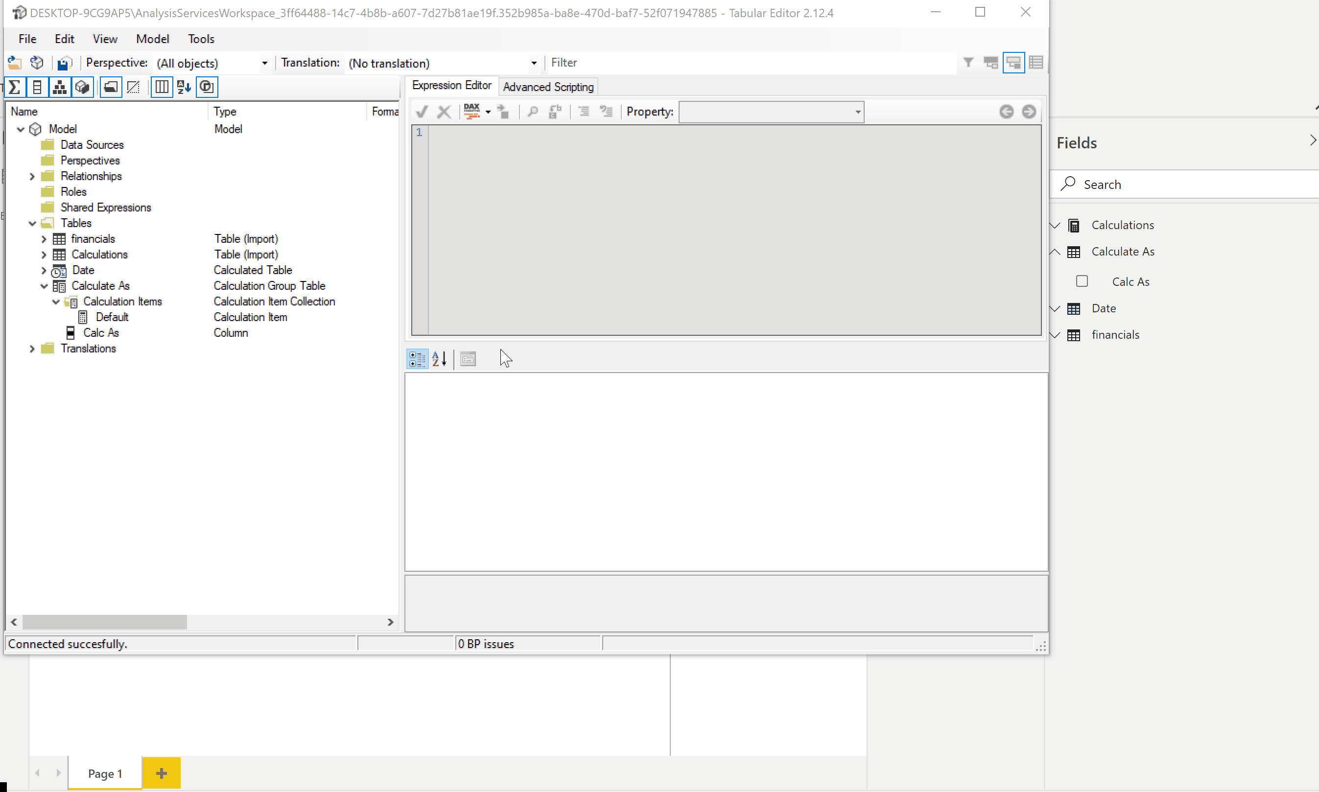
I like to create a calculation group so I can re-use the DAX patterns in my model. The typical approach is also so it can be used to simply change how the base measure is calculated too, without the need for all the new measures. Calculation groups have to be created in Tabular Editor.
External Tools, then Tabular Editor
Model --> New Calculation Group
Type a name for the calculation group -- I usually name it "Calculate As"
Expand the calculation group (it's like another table), and I also usually rename the bottom element "Name" to "Calc As" too. This is actually the field name the users see.
Right-click the element above it, "Calculation Items" and choose "New Calculation Item".
This one I name "Default" and the DAX for it is simply, SELECTEDMEASURE().

Add another "New Calculation Item" and this time name it "MoM%".
For this one, expand "Calculations" and copy the DAX from [Profit MoM%]
Paste the DAX into the "MoM%" calculation item and change the two instances of [Profit] to SELECTEDMEASURE() instead.
Save and close Tabular Editor.
In Power BI Desktop it will now ask you to re-calculate, which you should do.
Now you can use this Calculation Group as a slicer, like in the gif above, and it will affect all the measures (not just Profit!) on a page. You can also use it on a single visual using the filter pane and "Filters on this visual". My favorite use of it is to use it to create other measures, because especially in this scenario, you may want a combo chart with [Profit] and [Profit MoM%] as distinct measures.
I will then change my earlier [Profit MoM%] to:
This has three benefits.
One, the DAX is simpler and not duplicating a longer statement that is prone to errors as I copy it over (remember you had to update two [Profit] to SELECTEDMEASURE() when we created the Calculation Item).
Two, if I wanted to update how that MoM% is calculated, or I had made an error setting it up, now I only have to update it in one place and all my measures have the new definition.
Three, I can use this measure on a page with the slicer for Calculate As and it will not get affected by it again. That is, it will NOT calculate a MoM% on a MoM%.
I went ahead and created a calculation item for QoQ%, Prior Month, and Prior Quarter too:
I then created a measure each using these for Profit. I also used Tabular editor to copy and paste then adjust them for COGS, Sales, and Gross Sales. I also specified the Display Folder to organize them into folders.

[Units Sold] I put in a folder called the same, and then the two per unit prices, [Sales Price] and [Manufacturing Price] I put in a folder called "Per Unit".
Data model complete, publishing considerations
Now we have completed modeling the dataset! I can start building out my report now, and I'll do it in the same Power BI Desktop file to start. Once I get to a stage where the tabular data model is not being modified as much (modifications can still happen after too), I will break the model from the report. What does this mean? It means one PBIX will have the model and data, and I'll publish that to the Power BI Service. I then create a new PBIX and connect it to the published PBIX dataset. This new PBIX is where I'll make the report visualizations.
I do this especially when I'm going to create multiple reports using the same data. Perhaps an executive dashboard report and then a more detailed report for specific groups.
I do this when I have one report and I want to not refresh the data every time I make a report update. Having instead the connection to the already published and refreshing dataset means I don't have to refresh the data before publishing, I just publish. I can publish 5 times an hour, and the data doesn't get disrupted. The report only PBIX also doesn't have a copy of the data, so it is much smaller in size, which means it also publishes faster.
And I definitely do this when I have an incrementally refreshing dataset!
To break up the data model and report in a PBIX that has both, you can follow these steps. This assumes you start with a PBIX file named "Data Model".
In Power BI Desktop, save as with a new name, typically I add Dataset to the name, so "Data Model Dataset". (Save as, not rename -- we want the original too!)
In "Data Model Dataset", remove all the report pages, maybe keeping a single page with refresh times or link to a PBIT template users can use.
Publish the "Data Model Dataset" to your workspace or shared workspace. Set up the refresh schedule.
Now close "Data Model Dataset".
Re-open "Data Model", the original PBIX file.
This time go to Transform Data and remove all the tables.
Apply the changes.
Now all your visuals are broken, but don't worry about them, and don't click "Fix" link on them!
Connect to Power BI Dataset, and navigating the connection to the "Data Model Dataset". Home --> Power BI Datasets --> search for "Data Model Dataset". Click Create.
Once connected all your visuals will be good again.
Publish, overwriting if necessary an earlier publish of "Data Model", the report.
Build the report!
Now to the fun part of building the report! I'll walk through that process in a future blog post!